Explore thousands of data visualisation projects and get inspired

Any topic SQL Python R Machine learning Data visualisation
Project photo

Spotify Recommender and Visualizer

By generating global song recommendations towards highlighting global talent and multilingual songs, our project aims to create a more diverse experience to music listeners while also providing a fun user experience by generating live, audio-responsive artistic visuals.
Julie Lai
Project photo

Using R Shiny to Inform Community Officials

Using a leaflet interactive map, we created a multilevel, informational dashboard that enables community officials to develop better insights into their population, facilities, and areas in need. This project utilized data from Census reports, facilities information, housing, and abandoned...
Brianna King
Project photo

US 2020 Elections Analytics

With my team, we used tweets collected with the Twitter API regarding the US elections of 2020. Using the LDA algorithm, we spotted the most talked topics in the months leading up to the election and for a short period after it. We also trained ML models with annotated data for gender...
Angelos Moavinis
Project photo

Strava Kudos Predictor

Created a tool that predicts kudos, a proxy for user interaction, on Strava activities (RMSE: 9.41) to see if it was random or if different attributes impact kudos in different ways. Attained over 4000 Strava activities using the Strava API and python. Engineered new features using domain...
Jack Leitch
Project photo

Covid19 Dashboard Netherlands

A Dash Plotly dashboard which visualizes Covid19 data concerning the Netherlands supplied by the RIVM: National Institute for Public Health and the Environment. The data on the dashboard is updated multiple times a day to provide up-to-date visualizations. The web application is hosted in a...
Johan Bekker
Project photo

Cost of Renting a House in Lagos State, Nigeria

I scraped, cleaned, and analysed real estate data with R to determine the factors that affect the cost of renting residential properties in the state, using PowerBI to visualise insights generated from the analysis.
Daniel Obi-Enadhuze
Project photo

Condition report with reflectance and absorbance datasets for Sunday in London (OCLC No. 2756214)

This is a condition report that measured reflectance and absorbance datasets for the paper used in the 1833 publication "Sunday in London"
Huw Sandaver
Project photo

Condition report with reflectance and absorbance datasets for Moran, Patrick Francis. History of the Catholic Church in Australasia, from Authentic Sources. Sydney: Oceanic Publishing Company, 1894

This is a condition report that measured reflectance and absorbance datasets for the paper used in the 1894 publication "History of the Catholic Church in Australasia"
Huw Sandaver
Project photo

IBM course project: Classification

As a final project for the third course of the ibm machine learning specialization, do various classification models to make a explanation of the insights and learn in the course
Vicente Figueroa
Project photo

Heart rate prediction using Logistic Regression

World Health Organization has estimated 12 million deaths occur worldwide, every year due to Heart diseases. Half the deaths in the United States and other developed countries are due to cardio vascular diseases. The early prognosis of cardiovascular diseases can aid in making decisions on...
Akriti Sood
Project photo

2nd COVID year using Tableau ✨

Examine 2nd COVID year data. Link to Dataset: https://ourworldindata.org/covid-deaths
Mahmoud Reda
Project photo

2020 U.S. Presidential Election Analysis

A tableau dashboard was created to analyze the 2020 United States Presidential Election. The result shows that the majority of the following demographics voted for Donald Trump - ages 45 and above, did not graduate college, male, married, live in a rural or small town, white people, earning...
Maynard Emmanuel B. Miranda
Project photo

Superstore Dashboard

A tableau dashboard was used to analyze the current and future financial and operational performance of the Superstore. The dashboard can be filtered by date range, region, state, city, and segment.
Maynard Emmanuel B. Miranda
Project photo

Analysis of Sample Courses Published on Udemy EdTech Platform

A sample of courses published on udemy.com was gathered from an article on Medium; the courses were grouped into four category. The dataset was cleaned, manipulated and explored for insight using standard pythonic programming. The cleaned dataset was exported as excel and subsequently loaded...
Nnaemeka Onyebueke
Project photo

Scraping & Data viz.

Allociné and imb Data viz are two projects for collecting data via web scraping, data analysis, and data visualization. the objective of the two projects was to analyze the cinema sector in France and to bring out relevant information for better decision-making by the individual. The analysis is...
Serge Amoungui
Project photo

Instagram Post Data Analysis

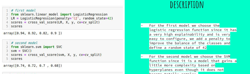
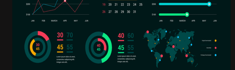
This project is an analysis of three months of Instagram data compiled between June 1, 2022 and August 31, 2022 studying the effects of a variety of variables, time of day, part of the week, post type, and content type, and the result of these on two key social media metrics, accounts reached...
Tyrone O'Garro Jr
Project photo

Sales Segmentation Analysis

Sales dataset found on Kaggle of what is presumed to be the sales data of a multinational corporation. The dataset contains sales data of 307 distinct orders, 287 of which have been shipped, 7 products, 73 cities, 19 countries, and 4 territories. The goal of this analysis is to explore the...
Tyrone O'Garro Jr
Project photo

Predicting Airbnb Rental Prices in the U.S.

This project analyzed the factors that may have significant roles in affecting prices, which will provide comprehensive insights about Airbnb rental price valuation across the U.S.
Kathleen Yoojin Jeong
Project photo

Predicting Yelp Review Quality

Using natural language processing (NLP) and machine learning (ML) to predict the usefulness of Yelp reviews given the review text and metadata surrounding the reviews.
Jeff Johannsen
Project photo

ِData Analyze of Job Postings (Indeed USA)

On this project, I've worked on data from Kaggle (https://www.kaggle.com/datasets/yusufolonade/data-science-job-postings-indeed-usa). The data contains 1200 sample rows and 9 features. Finding relations between features and visualization necessary for more understanding is the goal of this project
Mehrad Tavanamehr
Next page